Case study.
app dashboard redesign.

Reinventing a fitness app's home experience to improve overall user engagement and retention.
Background.
There's enormous potential to impact our key metrics through updates to the dashboard.
The dashboard screen on the Openfit app is the most viewed screen with 73K total monthly views. Over time the dashboard screen has incorporated various features, content, and flows to get users to work out anywhere, anytime.
As design lead, I partnered with the product and tech lead, and together we set a plan to take a step back to reinvent the dashboard to get our app into a place where we can focus on particular items to improve overall experience and engagement.
My role
Lead Product Designer
Responsibilities
Research, Competitive Analysis, User Survey, Design, Prototype, Test
Team
Product Manager, Tech Lead, Devs (2), QA
Platform
iOS, Android
Duration
Oct. 2021 – Jan. 2022

About.
Background.
Openfit is the all-in-one destination for fitness, nutrition, and wellness.
The streaming platform (mobile app, web, TV, bike) includes world-class workouts you can take on-demand, Live group fitness classes, personalized nutrition plans, and tracking.
Key problem.
Engagement on the app typically drops off after a month from enrollment.
The dashboard is the point of interaction for users after opening the app. Users are dropped into the dashboard with a lot of options and no clear call to action.
Engaged users on month 1:
49.5%
Engaged users on month 2:
18.1%

Current Experience.
Difficulty in digesting content could be a factor why new users do not engage as often. Users have addressed that the content and design feel outdated compared to other fitness apps.


Goal & Opportunity.
Conduct an audit of the current dashboard experience to find areas where we can improve.
We will clean up the current experience to remove excess information and noise to keep things focused for a user. Take the winnings and learnings, and build upon them in the future. We believe that updating the user experience will have noticeable improvements in our overall metrics.

Key Metrics.
Increase:
• 1st & 2nd-month engagement %'s
• Qualified views
• Program enrollment
• Log-ins
• Free-to-paid conversion
• Retention
Approach taken.
Research
Define
Design
Test
Validate
Research.
Data informs decisions.
I started to look into the analytics of the past 6-8 months to understand what areas get the most engagement. With the information presented, we decided to take a content hierarchy approach to improve the dashboard.
• High engagement content moves up the page.
• Low engagement would be less prominent.
• Rollback if the impact is not what we expected.
• We can always A/B test item placement.

Above: Amplitude was used to gather dashboard analytics for the months of April — October 2021.
User survey.
What do users want?
I conducted a 14-question dashboard survey (using usertesting.com) with 15 Openfit core users to help us:
•understand what is currently working.
•learn what users want.
•identify current pain points.

User insights.
What did we learn?
After reviewing all user interviews and analyzing the gathered data, I was able to identify that the core area of opportunity is personalization.
Personalize.

Conceptualization.
Solving for an engaging personal experience.
I started creating low and hi-fi dashboard concepts using existing components. Some of the large swing ideas I presented to the team and later user-tested, were all focused on personalizing the user experience. Below are a few high-level concepts that I designed and prototyped during the ideation process.

Concept 1
Smart Recommendations
Hypothesis: We can increase user engagement on the dashboard if we build a strong AI that can better recommend users' content based on their interests. The collected data would come from onboarding answers and workout history.
Concept 2
My Dashboard
Hypothesis: Personal stats show high engagement under user profile. If we build a true widget style dashboard to highlight stats upfront and center, it would create a fun gamified experience that would motivate users to continuously engage.


Concept 3
My Schedule
Hypothesis: We see a large increase in free-to-paid conversion for users who enroll in a workout program. This idea delivers a tab format dashboard where one is focused on completing today’s tasks and the other is dedicated to content discovery.
Design and Validate.
Final Solution
After a few weeks of refinement, stakeholder reviews, and user testing validation, we confidently netted out an elegant design that separates two specific actions into separate tabs. We felt confident that this solution would help increase overall user engagement in the app.
The next step was running an A/B test utilizing Optimizely to test the new experience vs. the current design. This approach would allow us to truly understand the impacts before rolling out to 100% users.

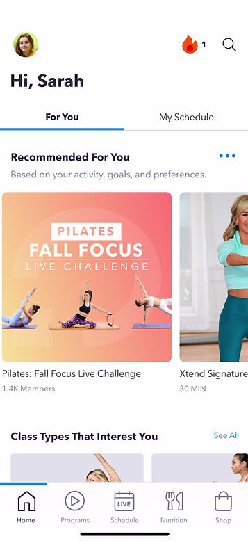
Above
For You tab: Browse personalize content based on user activity.
My Schedule tab: Clear location to see my upcoming classes, log meals, and track weight.
Outcome
Seeing Results
We released the app A/B test update on December 2021, just in time for "New Years' Resolution Season. We were excited to be pulling in data on the new design and using it to make more informed design decisions for the future.

Dashboard redesign in action.

Big Wins
+8.5%
Avg. daily engagement on the dashboard
+13.2%
Engagement on month 1 (new users)


